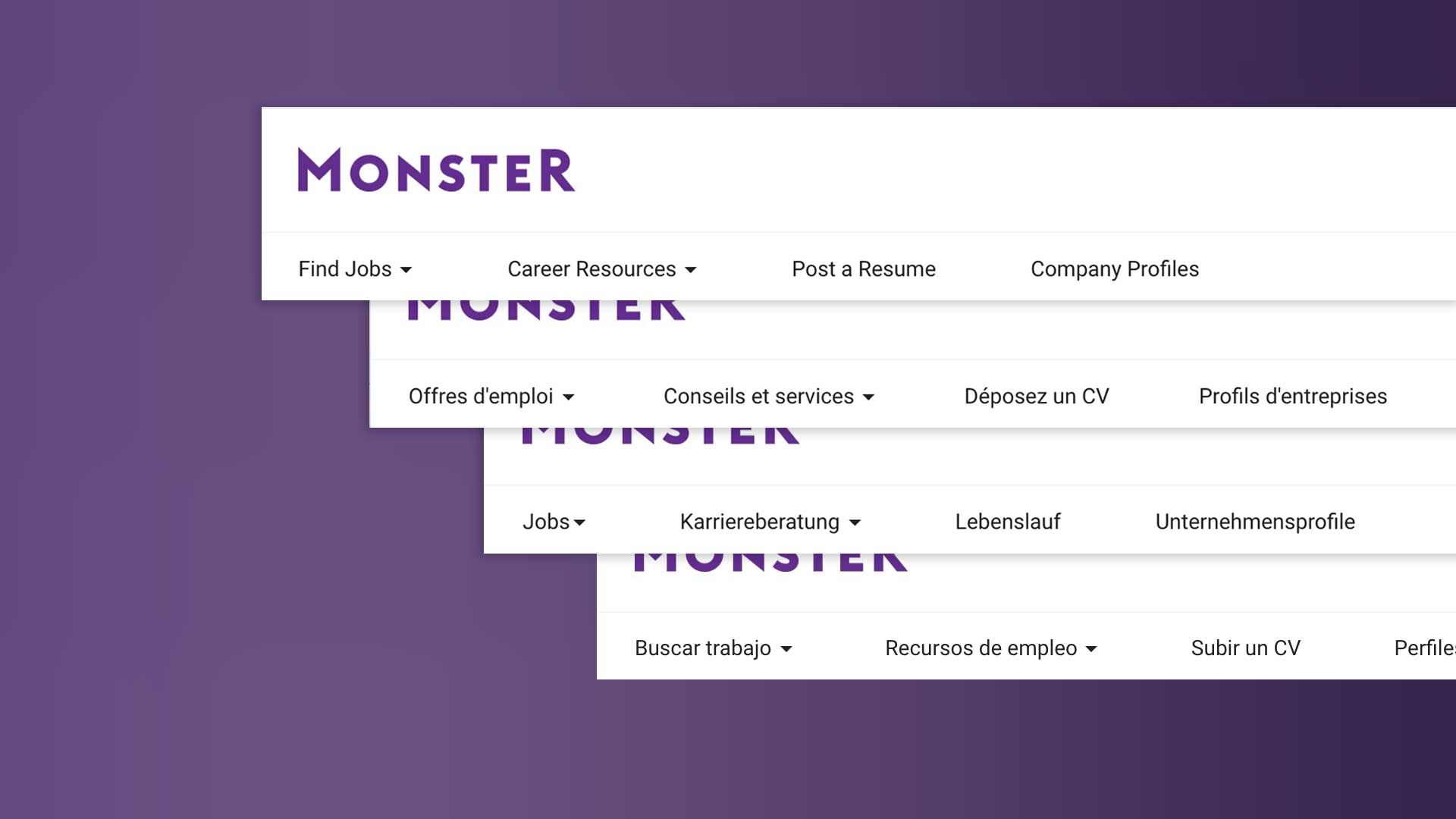
MONSTER.COM
Global Brand, Global Challenges
OVERVIEW
Every minute, 29 resumes are being uploaded to Monster.com, 7,900 job searches are taking place, and 2,800 jobs are being viewed. Monster sites are available in 40 countries and in over 20 languages. Whew!
The company was actively pushing to engage new users while embracing modern design-centric mobile-first principals and practices. Despite being one of the world's most recognizable brands, they were eager to refresh their myriad products to be consistent globally.
When the opportunity to help revamp one of the oldest dot-coms came up, I dove in head first.
MY ROLE:
Sr. Interaction Designer
Designing For International Audiences
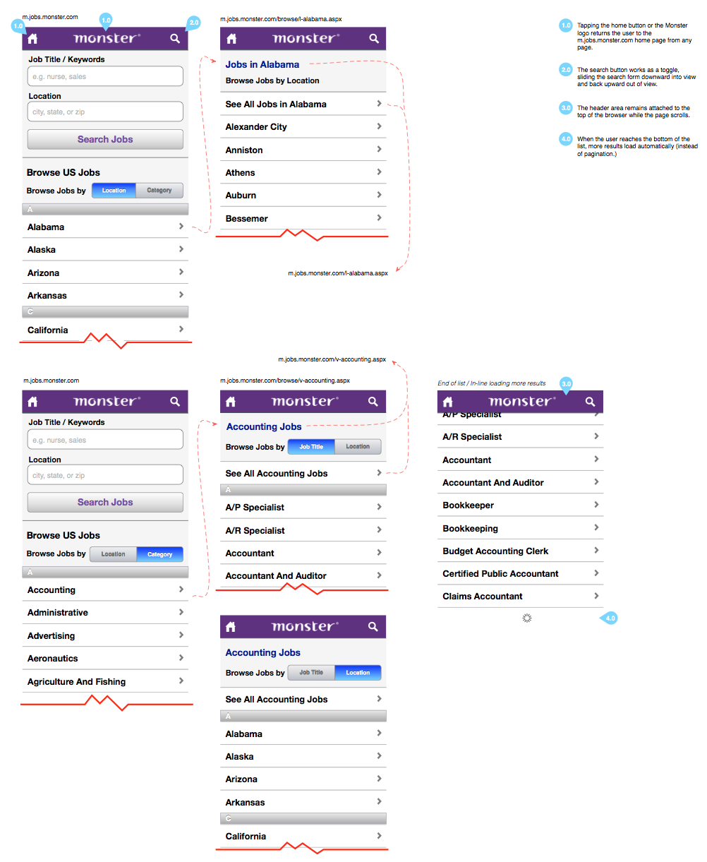
Working at Monster exposed me to the challenges of design at a global scale. While there, I was able to redesign 4 of the most critical revenue and lead-generating areas of the site: job search (40 million searches a month!), resume upload and management, the job application process and SEO-optimized landing pages. I'm happy to say each saw improved conversion and unique visitor growth.
One unique challenge was optimizing product designs and deliverables for simultaneous launch in 40 countries and in over 20 languages. Seeing your design work launch in languages you can't speak is actually exciting!
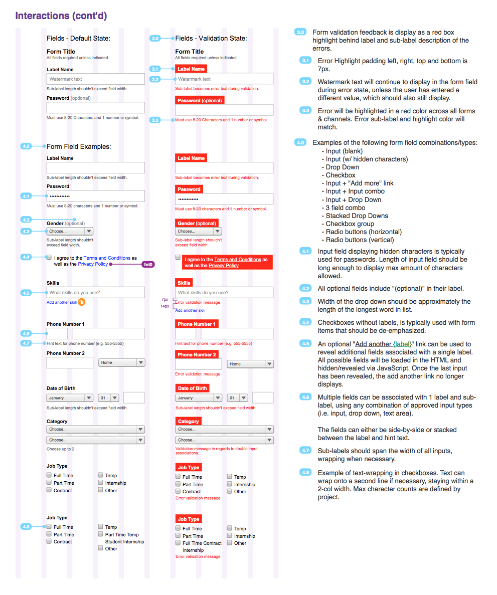
The company wanted to unify their design patterns world-wide. Working in tandem with a team of developers, we first developed a scalable framework for UX, Visual and Code components, then produced extremely detailed interactions for a our entire library of key components and patterns.
Interfaces for Real People
Inevitably, in large companies with lots of products and lots of stakeholders, many things often end up competing for the users attention at once. Over time certain decisions can become institutionalized, with "we've always done it this way" or "so-and-so needs this featured" heard at meetings.
Fortunately our mission to modernize designs and processes allowed us to take a fresh look at the product's primary layouts and flows. Building on user data, research, and user testing, we were able to simplify and improve layouts (and under-lying assumptions) that had far outlived their lifespan. With millions of users a day, we were able to see that small improvements can add up to large results.
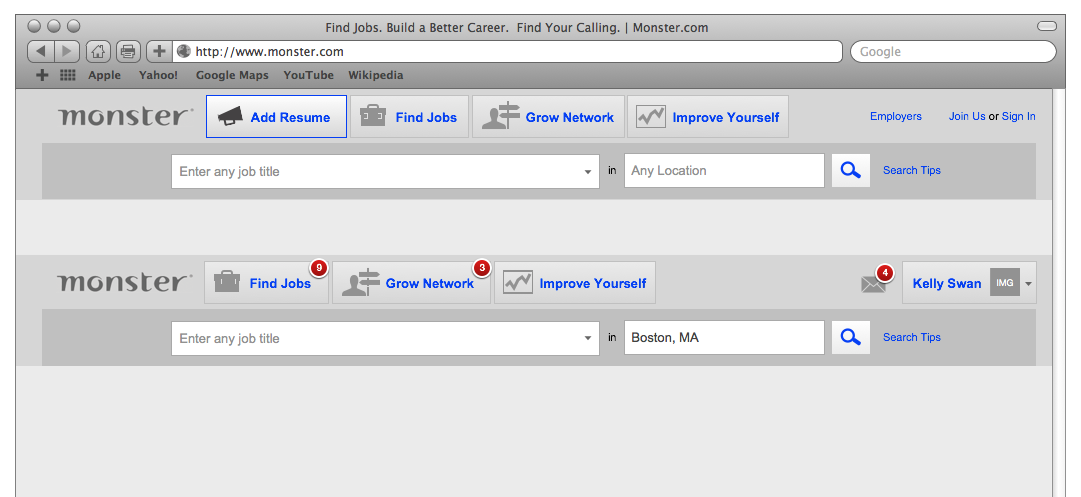
A prototype is worth a thousand meetings. This concept explores a simple, user-centric way to easily navigate all facets of Monster.com. (The existing header had over 40 links!
Accessibility Matters
Unfortunately, a lot of websites do not adhere to web accessibility guidelines. During my time at Monster, we took strides to make sure our designs met Section 508 and WCAG accessibility standards. This often meant rethinking and redesigning complex interfaces in ways that benefit everyone, including those with disabilities. As one of the top job listing websites, complying with accessibility standards meant everyone has an opportunity to find a job. It's the right thing to do.
Thinking (and Scaling) Globally
The company wanted to unify their design patterns world-wide. Working in tandem with a team of developers, we first developed a scalable framework for UX, visual and code components, then produced extremely detailed interactions for a our entire library of key components and patterns. Because development teams were distributed around the world, thorough documentation meant consistent products.
Selected Works

NBCUniversal Streaming ConceptsProject type

Associated PressProject type
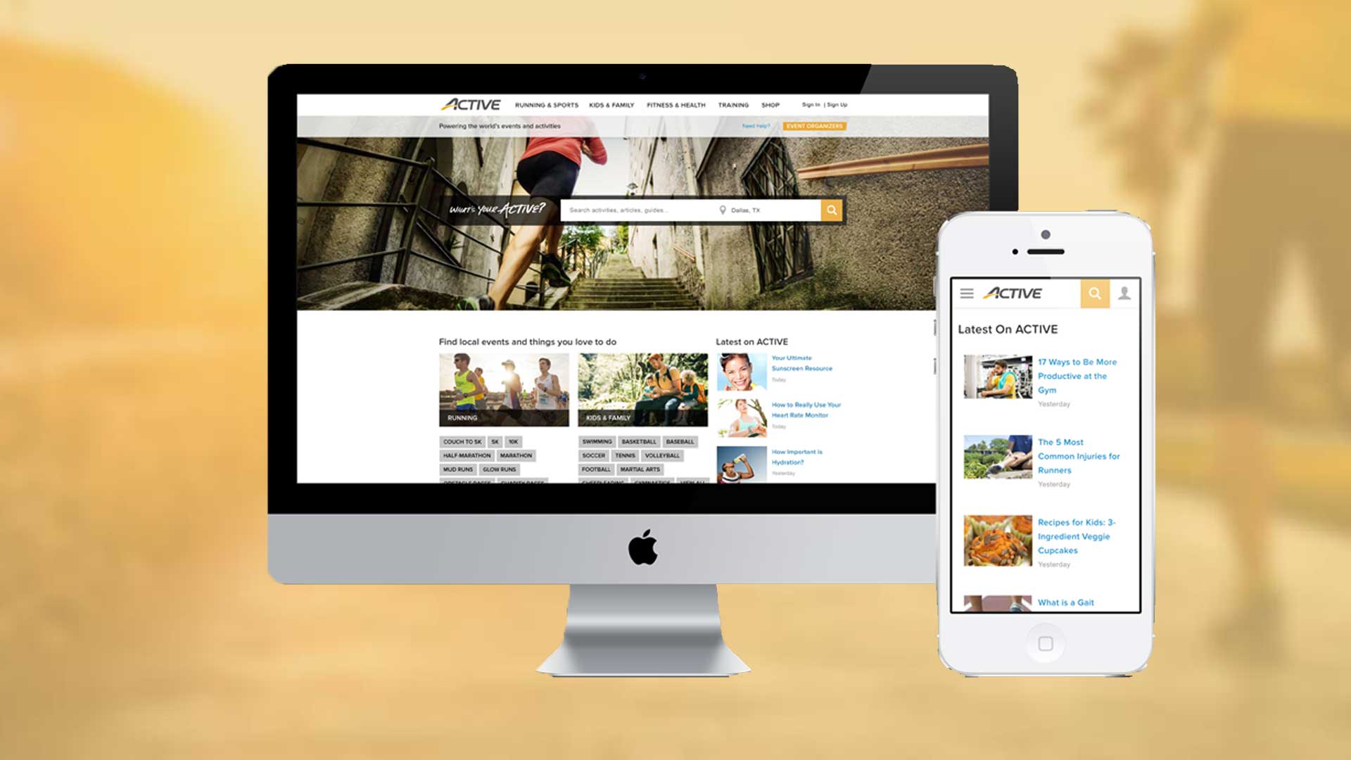
Active.comProject type

Active KidsProject type
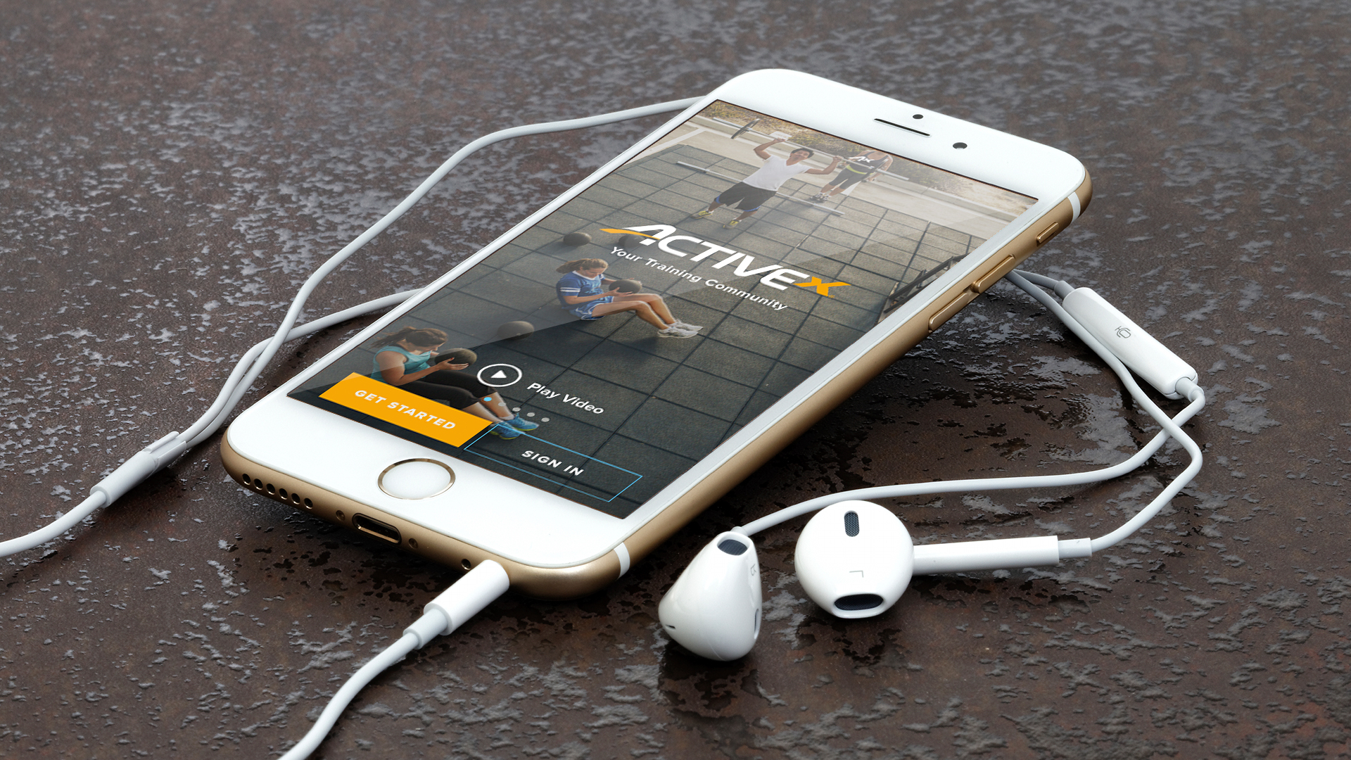
ActiveXProject type
Monster.comProject type

THXProject type
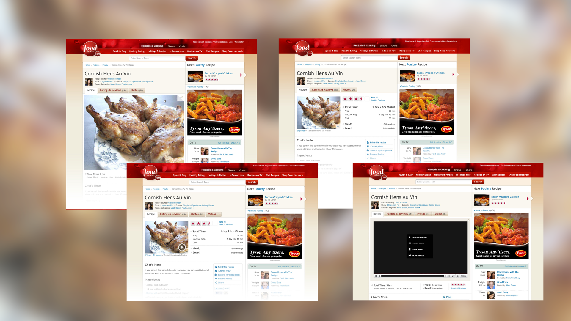
Food NetworkProject type
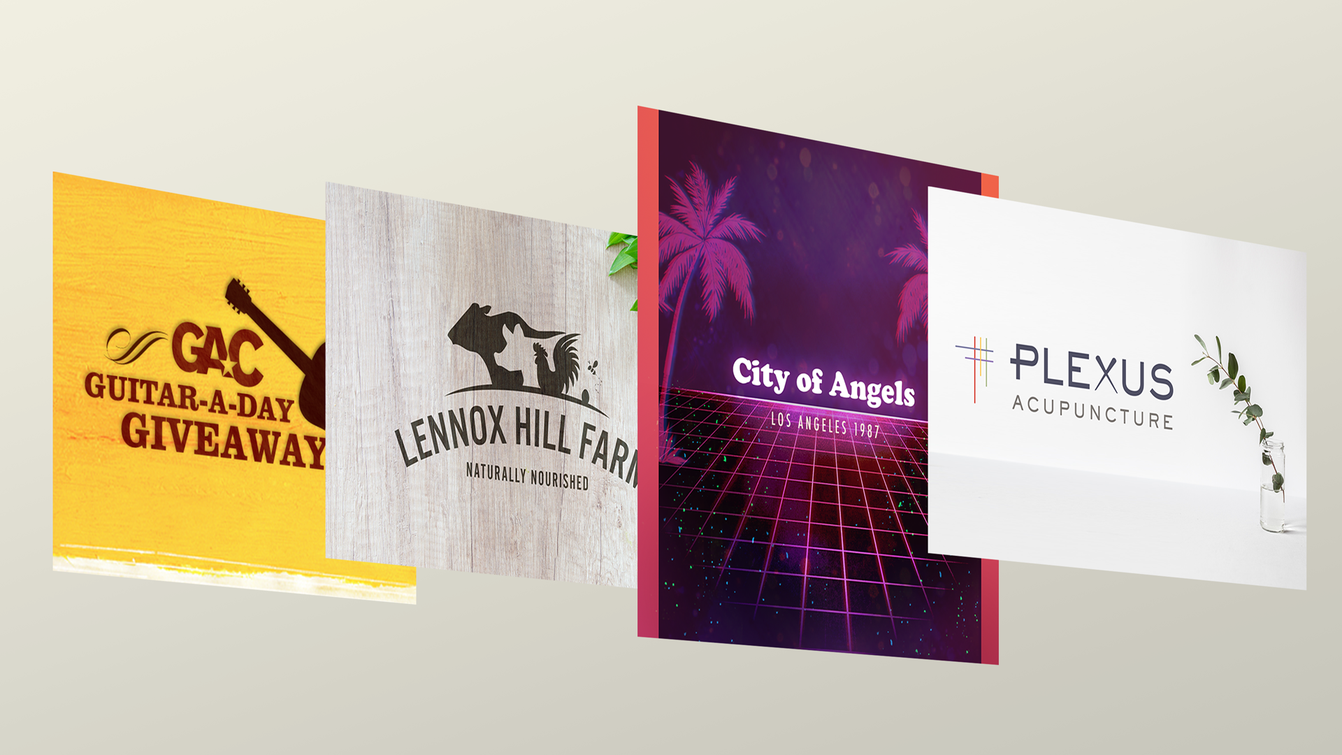
Creative DirectionProject type